Sentiment Radar provides you with insights on the products you care about. Let's get to know how those insights are displayed.
After signing in to the app you are shown your personal overview which is a list of the products you have explored and provides you with an overview of each product's sentiment.
The product detail view is where you are taken when you click on an entry in your overview or on a search result. Here is where you investigate if the product in question is the right one for you.
Personal Overview
As mentioned in this post when you sign in you are taken to your personal overview. Which looks like this:
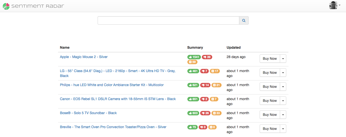
On your very first sign in you will be presented with a list of the currently featured products. Featured products are a curated list of interesting and popular products. Selecting one will add the product to your personal list and take you to its details. Once you have at least one item in your personal list this view will show you your personal list.
By searching for a product and selecting a search result you will also add to your personal product list.
Zooming in on a particular row in the table yields:

From left to right the columns are:
- The name of the product
- A sentiment summary: there is a pill showing the number of positive, negative and neutral reviews
- The time when this analysis was done
- A buy button which will add the product to your shopping cart and quickly get you to your purchase
Clicking on the product name will take you to the details.
Product Details
There are 3 sections of a product detail. When arriving here the feature breakdown is shown while the other 2 sections are hidden.
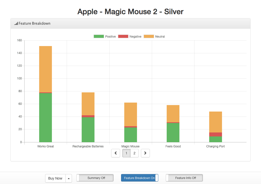
The feature breakdown section shows the most spoken about topics in all the reviews. Each topic has a stacked bar associated with it. The bar represents the feelings people have toward the specific topic. The overall height of a bar denotes how many reviews contain this topic. The individual colours inside a bar show the feelings towards the topic, the more green in the bar the happier people were with the topic.
Use the page control at the bottom to move between pages as quite often there are more topics then can readably displayed. Moving pages here in the feature breakdown is syncronized with the pages of the feature info section.
Feature Info
While the feature breakdown chart if often all that is needed to make a sound decision sometimes we want to know more about what makes up a single topic. To see this information move the right most slider on the bottom control bar from Feature Info Off to Feature Info On.
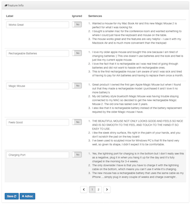
When displayed the detailed information is shown below the feature breakdown. Just like the page controls in the feature breakdown, the page controls here move between each page and are syncronized with the breakdown section.
Each topic is a row in the info table. Zooming in on a single row:
The row consists of 3 columns:
1 Label
Sentiment Radar does its very best to assign labels to topics that are meaningful. From time to time you may disagree with how a topic was labelled. In such a case edit the text in this column to what makes the most sense for you.
2 Ignored
Some times the greater public is discussing a topic that you just don't care about. That is what the ignore slider is for. By ignoring a feature you remove it from being displayed in the feature breakdown chart. The feaure isn't deleted, it will always be shown here and you can turn it back on by changing the slider again.
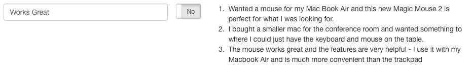
3 Sentences
Shown here are up to 3 sentences taken directly from the reviews which best reflect the context in which the topic label is used. Reading through these sentences will often shed more light into the true meaning of the topic's label.
Note: Any edits you make in the feature information table needed to be saved. Be sure to press the Save button at the bottom of the table to capture your changes.
Summary
The overall product details are revealed by moving the left most slider on the bottom control bar from Summary Off to Summary On.
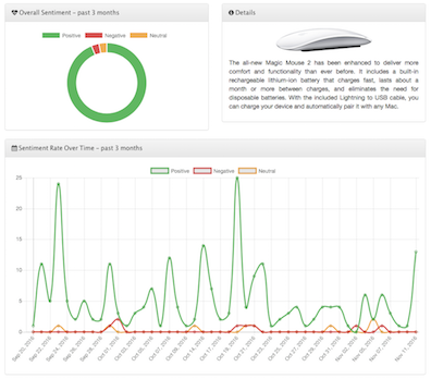
When revealed it is displayed above the feature chart and consists of 3 panels:
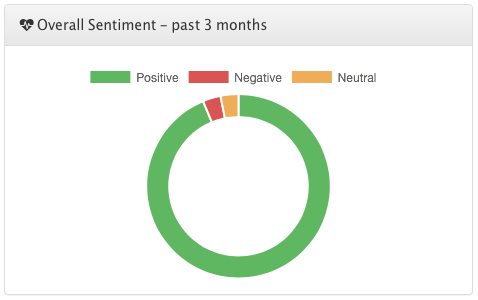
1 Overall Sentiment
The overall happiness with the product is shown as a doughnut chart. This plot shows the percentage of positive, negative and neutral reviews over the course of the last 3 months.
2 Sentiment Rate
The rate chart shows how the overall sentiment came to be. With the number of classified reviews plotted against time it becomes easy to pick out product updates which have caused a major shift in overall happiness. For example, a spike in negative reviews which begins on a specific day and carries on tell us that something, likely software, changed and the change was a good one.
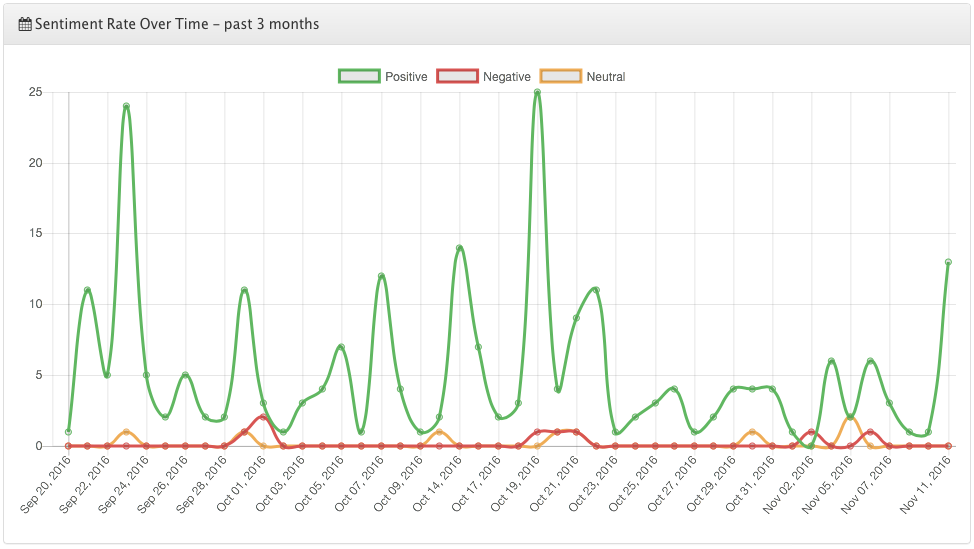
Like the overall sentiment this plot reaches back 3 months from the date of analysis.
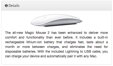
3 Details
A picture of the product and a summary description are displayed in this panel. Just in case you forget what you are looking at.